My job isn't beach, but I did it anyway.
Spencer, a white masculine person with short dark hair and glasses, grins at the camera from a beach. The sky is grey and overcast and the scene seems blustery, but his smile seems to say he doesn't much mind.


Today's #3Dprinting fail. It was good when I went to bed, but it looks like at a certain layer, it started having extrusion issues. Unfortunate, too, because that means a narrow bridge that was held up only by supports was weak and not cohesive, so when I started tearing out the supports, it frayed and broke.

It's so consistent at that height and above, I wonder if there's a mechanical issue interfering with the filament feed...
An oblong 3D-printed object made of black plastic. About half a centimeter from the top, the layers of material start looking pockmarked and rough, instead of smooth.


Tepache fermentation number 3 has begun!

This time, I'm using a lid with an airlock, and I've put a plastic bag with water in it inside the jar to keep the fruit submerged. I'm hoping those two steps help prevent the mold I got in batch 2.

I also added a single dried chile de árbol for a bit of heat.

Fingers crossed for a tasty drink in a couple days!

A large mason jar containing pineapple peels and chunks of pineapple core, as well as a yellowish liquid. The jar sits on a cutting board in a beam of sunlight coming through the window from a clear blue sky.

#fermentation


Here's a look at my #WIP design for my new website, built using Hugo. Sharing it here so that I can hopefully inspire myself to get back into the swing of working on it. 😅

A homepage entitled "Key and Card". Article cards of different types are laid out in a grid. The background features a geometric design in light greys.

#WebDesign #Hugo


Content warning: beverage, fermentation


A year or two ago, I was given a #lockpicking set for my birthday, containing two picks and two rakes, as well as three practice locks (with cutaways to show the pins).

I've found it really hard to develop the skill, however. I can't reliably feel or isolate pins, and I don't know if I have the right amount of tension. I sometimes manage to pop a lock, sometimes repeatedly, but nothing about that experience seems to transfer to a new lock.

What are your recommendations for beginning to learn? Are there particular locks (whether practice locks or normal ones) you'd suggest? Any other resources I should check out?

#locksport
A lockpicking set, containing two picks, two rakes, a bunch of tension wrenches, and three brass (I think) practice locks


Okay, this was super fun. Especially for the first new set I've built in probably 15 years. #LEGO #AFOL
LEGO set #31131, depicting a small street corner with a noodle shop and apartment, assembled and on display on a shelf


You have a block quote that starts with [quote] but ends with a "/code" tag. At least, that's what I see.
BBCode tag mismatch in text: the paragraph opens with a "quote" tag, but closes with a "code" end tag.


I'm very pleased with how this little site logo for my website-in-progress is turning out. It unfurls when you mouse over it!
Logo of a card with a key on it, next to the title "Key and Card" in a chunky font that evokes old tarot cards
Same logo as above, but instead of one card, there are the outlines of three, splayed outward.


It's so nice and centered! And... it's 8 boxes wide, so I'm going to have to break something to make a calendar. 😖

#journaling
"January 2023" handwritten in the middle of a dot-grid journal page


Right? Like, look at this absolute icon:
Illustrated web page with sneakers and arms, holding a banner that reads "Welcome to my web page, cyber dudes"


New task on my list, after days of trying to make a CSS Grid-based layout that didn't use any media queries at all to be responsive:

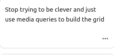
Task card that reads "Stop trying to be clever and just use media queries to build the grid"

#webDesign #webDesignNovice #CSS


Content warning: New York Times, user tracking


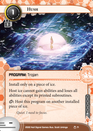
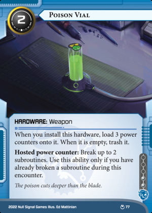
For the first time, I've written flavor text for #netrunner cards that will actually be going to print!

These two cards are from @Null Signal Games' upcoming release, Parhelion.

Netrunner card from the Parhelion set:<br>Hush<br>Anarch Program: Trojan<br>Install cost: 1 - MU: 1 - Influence: 1<br>Install only on a piece of ice.<br>Host ice cannot gain abilities and loses all abilities except its printed subroutines.<br>{click}: Host this program on another installed piece of ice.<br>Flavor text: Quiet. I need to focus.<br>Illustrated by Scott Uminga. Illustration depicts a figure in a calm white dome of light, surrounded by a flurry of digital noise.

Netrunner card from the Parhelion set:<br>Poison Vial<br>Criminal Hardware: Weapon<br>Install cost: 2 - Influence: 2<br>When you install this hardware, load 3 power counters onto it. When it is empty, trash it.<br>Hosted power counter: Break up to 2 subroutines. Use this ability only if you have already broken a subroutine during this encounter.<br>Flavor text: The poison cuts deeper than the blade.<br>Illustrated by Ed Mattinian. Illustration depicts a tube of glowing green goop, adorned with a "Mr. Yuk" sticker and connected via thick cable to an offscreen computer.

You can find those cards, as well as many others, on NetrunnerDB.


Winston does not seem nearly as fazed by the gloomy weather as I am. #cats #CatsOfMastodon #MastoCats #caturday
Winston, a small brown cat, looks down the sidewalk in a residential neighborhood. The trees are barren against the cloudy grey sky, their leaves littering the ground, but Winston's ears are perked up—he won't be discouraged.


As I've watched more James Hoffmann videos, I've wanted to develop my currently-nonexistent palate for #coffee. I nabbed this bottle of Stumptown #ColdBrew from a bargain grocery store yesterday, and whaddya know, I actually really liked it!

It had a really bright, fruity flavor without too much bitterness or acidity. I stirred a bit of cream and sugar into the mug, but honestly, it was pleasant enough straight out of the bottle that I could have drank it all that way.

Of course, there's no information on the bottle about the origin of the coffee, so I can't learn much in that regard. But hey, here's to actually tasting coffee!
A stubby brown bottle of cold brew coffee


Content warning: alcohol


Oh good, I needed another new hobby.
A new soldering iron on a workbench


Before I left for work this morning, I added the directory of my in-progress Hugo site to Syncthing so I could access it on my work computer. I'm glad I did. After my morning clients were done, I had a bit of a breather, and I was able to fiddle with CSS a bit.

Started adding some neutral defaults to the base CSS for my theme. I have a more opinionated theme in mind right now, but I like the idea of having a basic fallback that's stylish enough.

A webpage. The prominent title reads, in a font evocative of enchanted calligraphy, "Key and Card". The background is a neutral light grey with a gradient of darker squares descending from the top. A navigation bar at the top reads "Home - Yarns - Works - Micro - Games - About". The main content area is divided into four sections: "Recent", "Craft", "Yarns," and "Section Four". Clearly, it's still a work in progress.

#theWorkshop


As tax, here's my boy Winston.
Winston, a brown and white cat, is all curled up on a blue ottoman. He's so fluffy, it's hard to figure out what part of him is what, but I think his little face is upside down.


[heads-up: Oregon politics, uspol, fashy eliminationist rhetoric, hostility toward the unhoused]

Wow, this mailer for the Republican candidate for governor in Oregon is just grossly fashy.
A campaign mailer. It shows a photo of a tent, likely an unhoused person's camp. The photo is doctored to have an ominous cloudy sky, and text reads: "OREGON NEEDS TO BE CLEANED UP."


It's really coming together.
Webpage with a deep purple background and a header style that evokes medieval scripts. The title of the page is "Key and Card". The sidebar contains a short bio and the main content section has four cards, labeled "Recent", "Craft", "Yarns", and "Section Four".


If you, like me, love pins and supporting artists and think NFTs are a fucking scourge, might I interest you in this lovely design? Mine just arrived yesterday and I'm very pleased.
An enamel pin that reads "KILL NFTS" sitting atop a business card-sized certificate of authenticity

I just saw a thing boosted about Mastodon's rules about no NFTs. A friend of mine manufactured a "KILL NFTs" enamel pin - I just got mine this week. He sells them on eBay. https://www.ebay.com/itm/125187728709


This was my solution to that problem:
A mason jar used as a drinking glass, with a blue rubber band wrapped around it


There's a field in my city across from the fairgrounds. For about a week each summer, it's parking for the state fair; the rest of the year, it's untouched save for geese and dog-walkers.

This last week, I've noticed swaths of blue flowers when I drive past, and today, I investigated further. Turns out, it's camas. From what I've learned, camas was a staple food crop for the indigenous people of this region before white settlers came and, well, did their settling thing. This wide meadow, I've read, was once full of camas—now it's a once-a-year parking lot and suburban neighborhood.

Seeing these blue flowers today helped me feel a little more connected to the land I live on.
Several blue-purple flowers on lanky green stalks


Screenshot of a website in progress. It has a deep purple background reminiscent of a photo of a galaxy, and white text over top. The headers are in a font that evokes old, mystical grimoires. The title of the page reads "The-Weave: home"

I'm finally goofing around with building a new personal website, with the hopes of eventually switching from WordPress to Hugo. It's fun to sling HTML and CSS around again.


there we go, nice and crispy
The same image as above (a sign that reads "In this house we PLONTS"), but with gross JPEG artifacts that make it look even worse.


I had a silly idea and someone (me) let me use Inkscape.
A rectangular bumper sticker or yard sign. In a black bar up top, it reads, "In this house we:", and there are rainbow bars below. Instead of containing orderly text, however, the word "plonts" is haphazardly placed atop the rainbow bars in a decidedly amateurish fashion.


"How would an ooze wear boots?"
"On top, of course."
Black-and-white drawing of a sentient pile of slime. It has a wide, goofy (and goopy) grin, and two boots popping out of the top. A speech bubble with a heart indicates it's making a happy noise.


Police are on track to get more military hardware under Biden than they did under Trump:


23340


The point has been made repeatedly, but I still cannot get over how "there is a market for labor, sometimes market conditions change, and companies actually have to participate in that market" is being covered like some crisis that requires desperate and unorthodox measures.

"Desperate employers using perks, pay to lure workers"


!Friendica Admins

I know I've seen this discussed before, but I can't find the conversation. Apologies for retreading old ground.

My node currently is not displaying link previews. If I draft a post and attach (using the paperclip icon in Frio) a link to this blog post, a rich preview of the link appears in the post composer, complete with featured image and subtitle:

The Friendica post composer, showing a rich link preview.

However, when I publish the post, the rich link preview is gone, replaced with a very plain link that only contains the title of the post:

Screenshot of a post containing a link. There is no rich link preview.

I'm running Friendica 2021.04. What might be causing this issue, and how can I troubleshoot and fix it?


Yesterday's crafting project: finally assembling my #piecepack! I did some serious redesigning this week, and sat down yesterday with my long #themagnusarchives backlog and put it all together.

I plan to release the files and create a version for sale on The Game Crafter soon.
A piecepack on a wooden table. There are several square tiles, dice, coins, and plastic pawns, each in four colors.


“cops prevent crime”

14509


tabletop games (x) board games (x)


Okay, here we go. This is boring but I guess I'm doing it.

This story of Eric Carle and his publisher "fighting bitterly over the stomachache scene" in The Very Hungry Caterpillar is fake. Eric Carle never said this, the interview is a parody, it was an April Fools joke. 1/?

13942

This website uses cookies to recognize revisiting and logged-in users. You accept the usage of these cookies by continuing to use this website.